Short answer
Excel stops being the right tool the moment more than one person edits the numbers, or the moment you need to know something before Monday. The fix usually isn't replacing your systems it's connecting them to a live dashboard that reads from where your data already lives. Most businesses should start with proof of concept on one report, typically four to six weeks, and only expand once they've seen it working with their own numbers.
Somebody in your business spends Monday morning building a report.
They export from the accounting system. Pull the sales sheet off a shared drive. Copy the operations tab from a file that only one person is allowed to touch because of the formulas. Paste it all into a master workbook, fix the columns that didn't line up, refresh the pivot table, and send a PDF to whoever asked.
By Wednesday, it's out of date. By Friday, someone asks a follow-up question that the report can't answer, so they ask for a new report.
I've watched capable people lose three or four days a month to this. Not because they lack skill, but usually the opposite, because building that workbook takes real expertise. That's what makes it expensive.
This piece is about when that ritual is worth automating, what replaces it, and how to find out cheaply before committing to anything.
Excel isn't the problem
Let me get this out of the way, because plenty of people sell business intelligence won't.
Excel is one of the best pieces of software ever made. It's flexible, everybody knows it, and for modelling, scenario work and one-off analysis, nothing beats it. If your business runs on a handful of spreadsheets and everyone's happy, you don't have a problem worth spending money on.
The trouble starts when a spreadsheet stops being an analysis tool and quietly becomes a system the place where the operational truth of the business lives. That transition happens gradually and nobody announces it.
Here's how you know it's happened:
More than one person needs to edit it. Now you have versions. Sales_Report_FINAL_v3_JK_edit.xlsx is a symptom of an architectural problem, not a naming problem.
You can't answer a question without building something. Every “how are we doing on X?” becomes a small project.
The numbers get argued about. Two people bring different figures to the same meeting. The meeting becomes about the numbers instead of the decision.
One person is the single point of failure. If they're on holiday, reporting stops. If they leave, nobody fully understands the formulas.
You're reacting, not steering. You find out about a bad month in the following month.
Two of these is worth a conversation. Four, and you're already paying for a dashboard in salary, in slow decisions, in the deals you priced wrong.
The failure mode that should worry you
Spreadsheet problems aren't loud. That's the issue.
When software breaks, you get an error. When a spreadsheet breaks, you get a number a plausible, confident, wrong number, which travels into a board pack and gets acted upon.
The public examples are instructive because they happened to organisations with serious resources. In October 2020, Public Health England lost 15,841 positive COVID-19 test results because the file format they'd chosen the legacy XLS format from 1987 capped out at around 65,000 rows. Nothing crashed. The data simply stopped being recorded, and nobody noticed for a week (BBC).
The European Spreadsheet Risks Interest Group, which catalogues these, records Norway's sovereign wealth fund losing roughly $92 million to a single incorrect date entry in 2024, and Standard Chartered receiving a £46.55 million fine in 2021 after one cell showed a positive number where it should have been negative or zero (EuSpRIG).
Your business is not Public Health England. But the mechanism scales down perfectly: a copy-paste that misses a row, a filter left applied, a formula that doesn't extend to the new rows added last quarter. None of it announces itself.
A dashboard reading directly from source systems removes the step where a human moves data by hand. That's the actual safety benefit, and it's larger than the time saved.
What changes when it's a dashboard instead
Not “prettier charts.” Four concrete things.
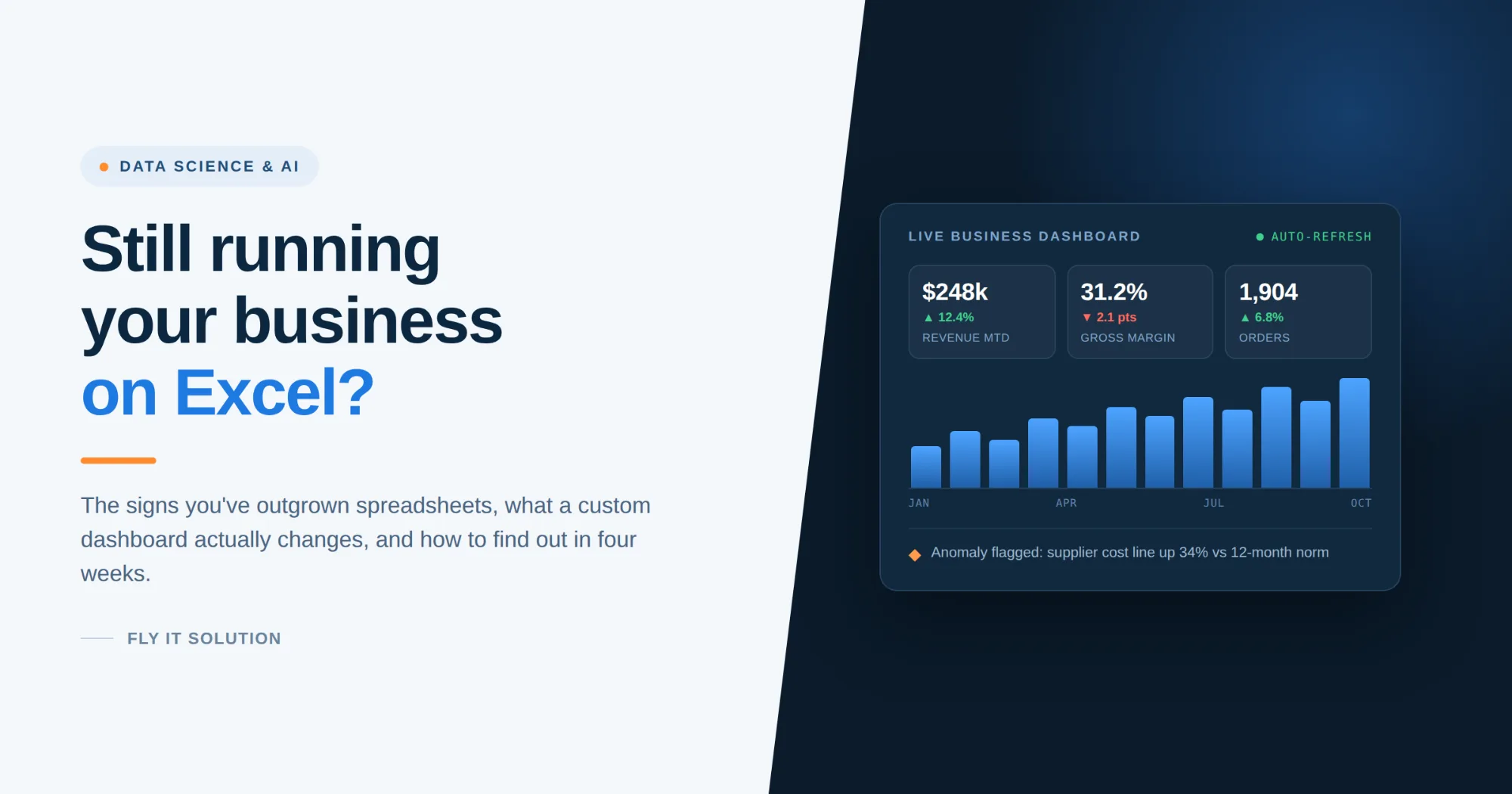
The number updates itself. Connected to your accounting system, CRM, e-commerce platform or database, the dashboard refreshes on a schedule. Nobody exports anything. Monday morning stops being a production process.
Everybody sees the same figure. One definition of “revenue,” one definition of “active customer,” agreed once and applied everywhere. This sounds administrative. It changes meetings.
You can ask follow-up questions yourself. Drill from the total into the region, into the product, into the individual transaction without going back to the person who built the report. This is the capability people underestimate most before they have it and rely on most once they do.
You find out sooner. Trends and thresholds surface while there's still time to act. A margin sliding two points is a manageable conversation in week three and a difficult one in month three.
Standalone tool, or connected to what you already run?
This is the question that decides cost and timeline, and it's worth answering before anyone builds anything.
| STANDALONE DASHBOARD | INTEGRATED WITH YOUR SYSTEMS | |
|---|---|---|
| Reads from | Files you upload or a dedicated database | Your ERP, CRM, accounting, e-commerce or database directly |
| Best when | Data is scattered, or systems have no usable API | Your systems hold clean, current data and can be queried |
| Effort | Lower to start; some manual data handling remains | Higher upfront; genuinely hands-off afterwards |
| Watch for | You've automated the charts but not the data entry | Integration work depends on what your vendors expose |
Most real projects land in between, and that's fine. Sales might come live from the CRM while a supplier's figures still arrive as a monthly file because that supplier emails a spreadsheet and no amount of engineering changes that.
The honest sequencing is connected to what can be connected, keep uploading what can't, and revisit later. Anyone insisting on full integration from day one is designing for elegance rather than for you.
Where AI genuinely helps and where it's oversold
There's a lot of noise here, so let me be specific about the difference.
Genuinely useful today:
Forecasting from your own history. Demand, cash flow, staffing with two or three years of clean data, a model will usually beat a manual projection, and it will tell you how confident it is.
Anomaly detection. Flagging the transaction, the cost line, or the customer behaving unlike itself. This is the one that quietly finds errors and leakage nobody was looking for.
Asking questions in plain English. “Which products lost margin last quarter?” typed into a search box rather than requested from an analyst. Genuinely good now, and it's what makes a dashboard usable by people who won't build their own charts.
Categorizing messy text. Support tickets, product descriptions, supplier names spelled six ways. Tedious for people, easy for a model.
Oversold, in my experience:
AI that fixes bad data. It can't. Models are more sensitive to inconsistent data than spreadsheets are, not less. If your customer records are duplicated across three systems, that's the first project and its unglamorous data work, not AI.
Prediction without enough history. Six months of data won't tell you about seasonality. Anyone promising a forecast from it is guessing with extra steps.
Black-box recommendations. If a system tells you to change your pricing and can't show you why, don't act on it. You should be able to trace any output back to the rows that produced it.
The useful test when someone pitches you AI: ask what happens when it's wrong. A good answer describes confidence levels, a human check, and how you'd notice. A bad answer is that it won't be.
You don't have to throw your spreadsheets away
The fear behind most of these conversations is disruption that a new system means retraining everyone and abandoning work that took years to refine.
It usually doesn't.
The logic inside a good spreadsheet is genuinely valuable. Someone encoded how your business calculates margin, or allocates cost, or defines a qualified lead, and that knowledge often exists nowhere else. The job is to move that logic somewhere it can run reliably, not to discard it.
In practice: the spreadsheet frequently stays as the input for the parts that need human judgement, while everything downstream becomes automatic. People keep working the way they know. The reporting just stops being manual.
What this looked like on a real project
A client came to us with sales, expenses, operations and inventory spread across several Excel files plus a third-party platform, each maintained by a different person on a different schedule.
We consolidated them into a single Power BI dashboard with KPI tracking and drill-down, so the leadership view and the detail behind it came from the same source.
The hard part wasn't the dashboard. It was the fortnight before it, agreeing definitions. Two of their files counted revenue differently, one on invoice date, one on payment received, which meant the business had been quietly running on two versions of its own performance for years. Nobody had noticed, because nobody had ever put the two numbers next to each other.
That's the part worth budgeting for. The visualisation is the easy half. Agreeing with what a number of means is the half that changes how a company operates, and it needs your people in the room, not just ours.
Start with proof of concept
You shouldn't have to commit to a full schedule to find out whether this works for you.
Pick the single report that causes the most pain the one someone rebuilds every week. Get that one automated, with your real data, and use it for a fortnight. A proof of concept on that scope typically runs for four to six weeks.
By the end you'll know the things no proposal can tell you: whether your data is as clean as you assume, whether your team opens it, and whether the answers change any decisions. If it doesn't earn its place, you've spent a contained amount finding that out. If it does, you expand with evidence rather than optimism.
That's the sequence we'd recommend whether you work with us. Small, real, and reversible beats a big plan built on assumptions.
Frequently asked questions
When should a business move from Excel to a dashboard?
When more than one person edits the same numbers, when answering routine questions requires building a new report, or when different people bring different figures to the same meeting. Those signal that a spreadsheet has become an operational system without being designed as one.
Do we have to replace our existing software?
No, and usually you shouldn't. A dashboard sits on top of the systems you already run accounting, CRM, ERP, e-commerce and reads from them. Replacing working software is a separate, much larger decision.
How long does a custom dashboard take to build?
A proof of concept covering one meaningful report typically takes four to six weeks. Broader program across several data sources generally run for four to six months. The main variable is data quality and how many systems must be connected, not the number of charts.
Can it connect to our current system, or does it have to be standalone?
Both are possible and mixed approaches are common. Live integration depends on what your existing systems expose some vendors offer good APIs, others only exports. A realistic project connects what it can and keeps file uploads for the rest.
How much data do we need before AI is useful?
For forecasting, ideally two to three years of consistent history so seasonality is visible. For anomaly detection and plain-English querying, far less is needed. If your data is inconsistent across systems, cleaning it up is the first project regardless.
What if our data is messy?
That's normal and it's part of the work. Data assessment and preparation come before any modelling. Be cautious of anyone who skips it messy data doesn't stop a dashboard from being built, it stops it from being trusted.
The bottom line
If someone in your business is spending Monday assembling numbers by hand, that's not a reporting problem. It's a decision-speed problem, and it compounds every month you leave it.
You don't need a strategy, a data warehouse, or an AI program to start. You need one painful report, four to six weeks, and your real numbers in front of you.
| Book a free consultation → |
|---|
Fly IT Solution builds data, analytics and AI solutions from Mohali, India and Minneapolis, USA, with over a decade of delivery across healthcare, e-commerce, finance, EdTech, logistics and manufacturing. Our work spans Power BI dashboards, machine learning and predictive analytics, and LLM integration production systems rather than pilots, and no black boxes you can't inspect. The observations above come from projects we've delivered, including the ones where the answer was less software rather than more.
Sources: BBC News, “Excel: Why using Microsoft's tool caused Covid-19 results to be lost” (October 2020); European Spreadsheet Risks Interest Group, Horror Stories archive.